Color Palette
- zainfaridr
- Apr 8, 2025
- 4 min read
Updated: May 10, 2025
Planning the Color Palette: Green and Orange
In this project, I made a deliberate choice to use a green and orange color palette, both of which are complementary but carry distinct emotional undertones. The contrast between these colors serves not only to create visual interest but also to convey deeper psychological and emotional layers within the narrative. Here’s an in-depth look at how this color palette was employed throughout the film.
Color Selection: Green and Orange
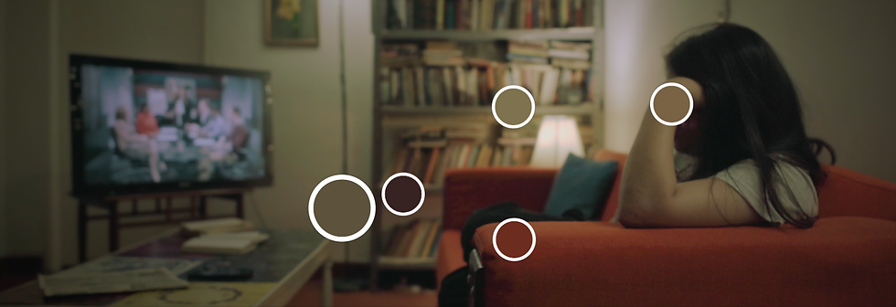
The primary color choice was a cool, muted green, which I used strategically to represent emotional detachment and internal conflict. Unlike the typical teal, this green leans more towards a subdued sage or lime tone. It functions as a visual cue to express the coldness and distance of the protagonist, Saif, from his emotions and from the people around him. This color emphasizes the isolation and internal struggle he faces throughout the story.

On the other side, the orange tones, ranging from warm amber to dark maroon, convey the illusion of warmth and comfort. Orange typically invokes a sense of security and ease, but in this context, it becomes a tool to create a false sense of tranquility. The contrast between these two colors, one cold and detached, the other warm yet deceptive mirroring Saif’s internal battle and the other conveying an outward appearance of normalcy and peace, with an undercurrent of unresolved emotional turmoil.
Creating the Illusion of Comfort
The use of green and orange in the apartment scenes, in particular, plays on the theme of fake comfort and false security. At first glance, the apartment appears inviting with its warm, mellow apricot light sources, TV screens, and ambient lighting all seem to create a sense of ease. However, the green tones that dominate the space, whether through soft lighting or the color of the furniture, constantly remind the audience of Saif’s emotional distance. This combination crafts an illusion of warmth and comfort, which is ultimately shallow and fleeting.

The apartment space, with its green lighting and orange accents, creates a psychological trick for the audience. We are led to believe that Saif’s life is stable and familiar, yet there is something unnerving about the way the colors work together. It’s as if the warmth we perceive is manufactured, masking the isolation and emotional conflict lurking beneath the surface. This visual contradiction reflects Saif’s attempt to maintain a normal life while grappling with a much darker past.


Shifts in Color During Flashbacks
In the flashback sequences, the color palette shifts away from the balanced green and orange seen in the present timeline. Instead, it leans into a more stark visual contrast between soft orange light and lifted blacks. The highlights are dominated by a muted amber or warm tungsten tone, often from a single controlled light source, which creates a nostalgic yet uneasy atmosphere. The shadows, however, are not fully crushed but rather lifted and desaturated, giving them a dusty charcoal appearance that flattens depth and makes the space feel drained of life.

This stylistic decision enhances the emotional dissonance of the scene. The orange light provides a faint memory of warmth or familiarity, but the surrounding darkness, muted and hollow, reinforces the weight and emotional void Saif carries from these past events. The blacks lack richness, which visually signals emotional fatigue or trauma. The overall effect is a visual metaphor for how memory softens the surface but preserves the underlying discomfort. The absence of vivid color saturation mirrors Saif’s detachment from the past, not in content but in emotional connection. It feels like the warmth tries to bleed through, but is suffocated by the stillness of the surrounding dark.

Psychological Effects of Color
Colors do more than just shape the visual aesthetic of a film as they are key tools for psychological storytelling. The use of green and orange not only creates a visually compelling contrast but also works on a deeper emotional level. The green is cold and impersonal, suggesting emotional detachment, while the orange serves as an emotional façade, luring the viewer into a false sense of security. This interplay reflects Saif’s internal conflict, his attempts to mask his true feelings with an outward appearance of warmth and normalcy.
Throughout the film, these two colors are never static. They shift subtly, reflecting the evolution of Saif’s psychological state. When the orange dominates, it suggests an attempt to reconnect with the world and find comfort. When the green prevails, it underscores the emotional distance Saif struggles to maintain. This dynamic creates a tension between what is seen and what is actually felt, enriching the film’s narrative and character development.

Lighting and Set Design Support
The integration of the color palette was not limited to the selection of colors in the frame but was also heavily supported by the lighting and set design. The greenish tones are subtly woven into the background of the apartment whether through the natural lighting, the color of the furniture, or the soft hues of the walls. This creates a sense of coldness that is punctuated by the occasional warmth of orange light sources. These light sources lamps, the TV screen, and even the reflection from a nearby window, help to reinforce the illusion of comfort and familiarity.
In the flashback scenes, the lighting took a more dramatic turn, with harsher contrasts between shadows and highlights. The muted grunge lighting created a feeling of oppression, while the intensified orange tones heightened the sense of urgency and emotional volatility.
Conclusion
The green and orange color palette was a central visual tool in telling the emotional story of Saif. By using a cool, muted green to represent his emotional detachment and a vibrant, warm orange to evoke false comfort, the color scheme reinforces the central theme of the film: the contrast between outward appearances and inner conflict. These colors, supported by precise lighting and set design choices, guide the viewer through Saif’s emotional journey, creating a rich visual texture that adds depth and complexity to the narrative.


Comments