Color Grading
- zainfaridr
- Apr 8, 2025
- 5 min read
Updated: May 19, 2025
Colour Grading and Palette Design
Colour grading was never just a technical step. It was the moment the film gained its emotion and identity. The point where scenes started feeling like memories instead of recordings. Where visuals began reflecting psychology. This wasn't about slapping a LUT and moving on. It was about sculpting a world that matched the emotional pulse of the story.
The Palette: Unease in Green and Faded Warmth
I wanted to root the visual identity of the film in psychological discomfort. That sense of discomfort needed to live in every frame. Not the overly saturated teal-orange you see in action blockbusters, but something far more nuanced and psychological. In my case, green became the symbolic cue for emotional rot, internal unease, suppressed tension. It showed up in places where unease was growing. Orange came in through light and skin tones, but never fully. It brought a hint of warmth that felt just a bit off.

This contrast was intentional. It echoed the narrative and supported the emotional beats. This imbalance held everything together. It reminded the viewer that things were never truly okay.
Grading by Emotion and Scene
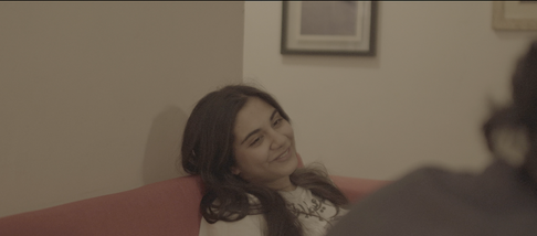
I approached each scene based on its emotional tone. I did not want one universal grade for every shot. For scenes in the present timeline, I reduced saturation and leaned into the cold green. Flashbacks, while still heavy, had more balance and slightly warmer tones. That warmth did not mean safety. It meant clarity. These were moments that looked better than they felt.
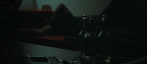
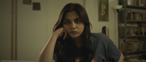
One of the most complex scenes to grade was the one at the table. The tension builds slowly, and I wanted the image to reflect that shift. I increased contrast subtly and pulled shadows tighter. Midtones drifted slightly into green. You barely notice it at first, but it builds under the surface. That invisible pressure was exactly the effect I was going for.
Precision Through Node-Based Grading
I used DaVinci Resolve for all of the grading. It gave me a level of control I had never experienced in CapCut or Premiere. This node-based grading made experimenting and isolating elements so much smoother. The green and orange palette is notoriously difficult to pull off, especially when you want skin tones to remain natural. Resolve made that manageable.
My node structure reached around 15 nodes. It combined primaries, secondary, balancing, isolated keys, color transform nodes, glow effects, vignette shaping, depth maps, DCTL's, HDR color wheels, and more. Every element had a specific function. Whether it was sharpening the highlights or separating skin tones from a tinted background, the structure kept everything flexible.

Texture, Skin, and Visual Continuity
Skin tone isolation was a major focus. This had always been tricky in earlier work, but this time I knew what I was looking for. I had learned that a good color grade depends on three things. Blacks should be black. Whites should be white. And skin should still look like skin. Once those anchors are in place, you can push the color grade wherever you want. That is how you make it believable.
I leaned into this principle when separating shadows and highlights. Shadows carried a green cast. Enough to induce discomfort. Highlights were kept clean. Mid tones sat between, often holding the emotional tension of a scene. Faces were treated carefully, using qualifiers to keep skin natural while the ambient lighting shifted. I added vignettes and halation for softness and focus, especially in scenes meant to feel more internal or psychological.
This shows the before and after from my correction node, which was meant to balance the blacks, the whites and the skin back to normal, to sell the look.
Continuity also mattered. Since the shoot took place across different lighting conditions, I had to match shots before applying the emotional tone. This meant fixing inconsistencies before building on top of them. It kept the story visually cohesive without feeling over processed.
Step By Step Progress
Raw Footage.

Applied color space transform - SLog 3 Cine -> Davinci Wide Gamut = More Control.

Applied CST - Davinci Wide Gamut -> Reco709 = What audience sees.

White balanced the shot, reduced warmth, until whites looked white.

Adjust primaries within HDR wheels
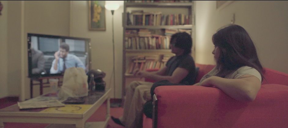
My green/orange node, exaggerated the effect as I would adjust for the cast

Balanced the whites, blacks and skin in my "to correct" node

A look adjustment

Reduced highlights.

Color balancing.

Added a vignette, adjusted to focus attention onto the actors.

Created a depth map, to bring the focus more on saba for now.

Before linking a mask with gaussian blur to the depth map.

After linking the mask to the depth map node.

Applied film grain

Raw vs Final
1.
2.
3.
4.
5.
6.
7.
8.
9.
10.
References and Visual Influences
A lot of the inspiration for the grading came from films I admire. Joker and Tenet stood out the most. Not just for their colors, but for how well their grading choices matched the character arcs. Joker’s use of muted green and heavy contrast informed some of my interior night looks. Tenet’s surgical precision and clean dynamic range reminded me to keep things tight and consistent.


Beyond those, I looked at visuals from psychological thrillers and modern horror. Films that looked grounded but still carried a feeling of unease. I wanted that quiet disorientation. The kind that feels almost real until you notice what is off. That tone was exactly what I was chasing.
Final Thoughts
Colour grading was one of the most enjoyable parts of this entire project. It never felt like a chore. That is probably because I have been grading photos/videos for over a year. My photography has been shared internationally and featured online. I have spent a long time learning what makes a grade work. So while the software was new, the process felt familiar. I was excited to adapt.
What I am most proud of is finally pulling off a green-orange palette that works. A few months ago, I tried something similar and failed. The separation was off, and everything looked muddy. This time, I knew what to fix. I understood how to protect skin, anchor tones, and create contrast without losing realism. The difference came from knowing how far I could push while keeping the image believable.
In the end, colour grading gave the film its soul. Without it, the footage felt empty and disconnected. With it, every shot felt intentional. Every frame told a story. This was the last piece of the puzzle that made the film complete.




















Comments